Schedule a demo
Menu
Request a demo

Six Steps to a Great User Experience [Infographic]

7/28/16 8:30 AM

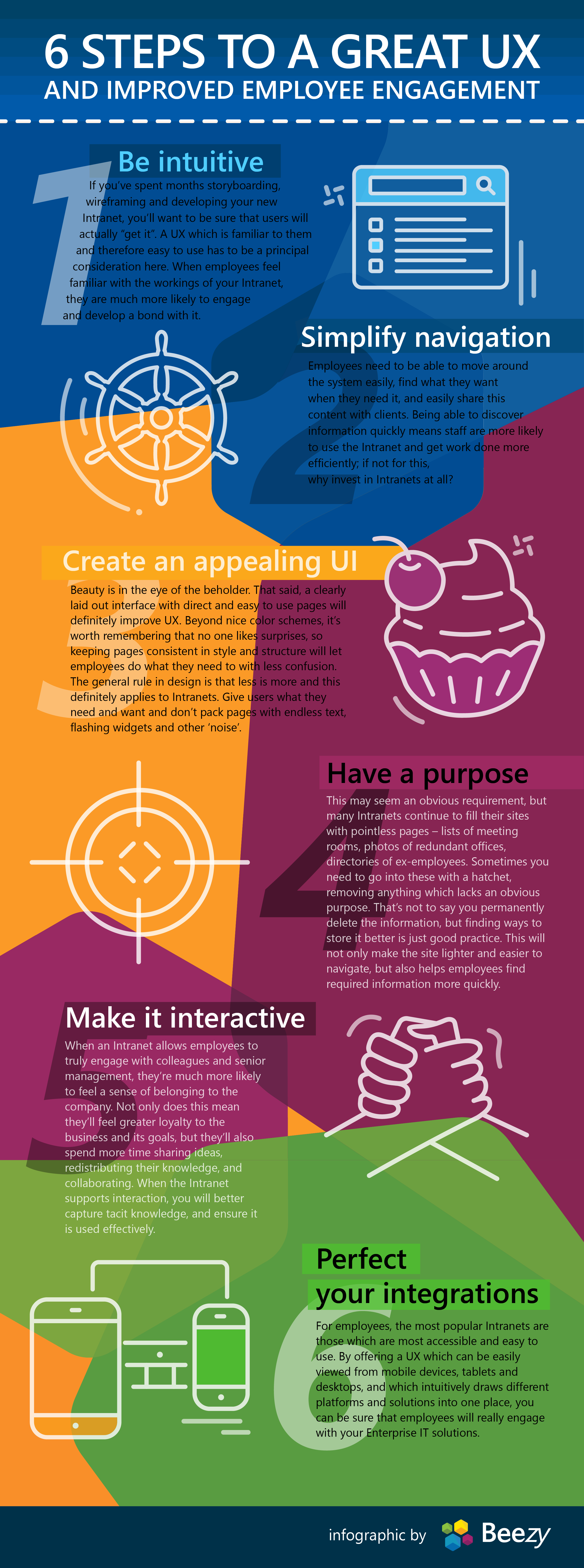
What does it take to create a great user experience? It's a topic we regularly discuss here at Beezy, because we believe that a great UX is an important part of creating a lasting and effective digital workplace. For example, back in June we shared an interview with our chief product officer, Maximo Castagno (@maximocastagno ), talking about the impact of "push versus pull" communication on end user adoption and engagement. In another post, we shared insights from a Gartner study that focused on the decline of user engagement, and how reversing that trend should be a key part of your IT planning efforts. And in January, we wrote about the need for personalization to give end users a sense of ownership and control over their collaboration efforts. To follow up with this content, the Beezy team created the infographic below to help drive home what we believe to be the UX essentials, giving you six steps to a great user experience and improved employee engagement.

If you like this infographic, please feel free to link to it (copy the HTML snippet below) and share with your team and network. And be sure to read through some of the great content on our website about improving your SharePoint or Office 365 user experience!


Six steps to a great UX by Beezy

You can add this infographic to your own site by copying this code:

<div style="clear: both;"><a href="http://hubs.ly/H03NyfB0"><img title="Six Steps to a Great UX"
src="http://beezy.net/wp-content/uploads/2016/07/6-steps.png" width="600"
alt="Six Steps to a Great User Experience and Improved Employee Engagement" border="0" /></a></div>
<div>Created by <a href="http://hubs.ly/H03NyfB0">Beezy</a>: Collaboration at Work</div>

To summarize the points made in the infographic:

  1. Make your design intuitive.
    It's not always about having all of the latest, greatest capabilities. Take the time to understand the tools and features that people like and are comfortable using, and deliver a UX that best fits the needs and culture of your end users.
  2. Think about natural navigation patterns.
    Historically, people have complained about the navigation within SharePoint. Don't bury critical information -- and don't assume search will solve everything. Be thoughtful about the flow of your site, and how easy it is for end users to "discover" important content and functionality.
  3. Look and feel are important.
    Your site should not look like it was designed with CorelDraw in 1995. Keep your design up to date -- and make your themes and branding consistent across the environment.
  4. Give people a purpose.
    Make it clear to people what the purpose is of each community, each sub-site, each list and library so that people understand their role -- and the benefit of the site.
  5. Collaboration is all about interaction.
    Your SharePoint is not (or should not be) a series of project "billboards" with static information that nobody cares about. To increase adoption, engagement, and end user satisfaction, give people multiple ways in which they can connect, share, and innovate.
  6. Provide seamless integrations.
    When people have to switch between different tools, it disrupts their train of thought, and they can lose valuable productivity. Consider how your various tools and systems not only fit into the browser window, but how they integrate with the content and interactions happening within the environment so that it is a seamless experience for end users.

Hope you find this information valuable!

Subscribe by Email